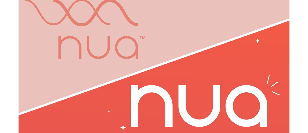
Women’s wellness and hygiene brand Nua has just unveiled a new look. It’s bold and edgy but retains the warmth and minimalism that consumers have come to associate with its range of menstrual wellness products.
As Nua embarks on an ambitious expansion beyond the D2C space, the company has recognized the need to evolve its visual identity to resonate with a broader audience and align with its new market positioning. The company’s marketing head discussed the key considerations that have shaped the brand's visual rebranding, including the desire to convey a sense of modernity, sophistication, and inclusivity.
The re-packaging follows a series of big milestones that the Mumbai-based company has achieved over the past few months. After turning profitable in June last year, it went on to cross the Rs 100 crore net revenue ARR mark and is now well on its way to surpassing the Rs 150 crore mark. The company’s growth momentum attracted new investors and this February, Mirabilis Investment Trust led a pre-Series C round to fuel further growth. Along the way, its range of products has expanded from sanitary pads to disposable period panties, menstrual cups and post-partum products.
We caught up with Nameeta Saigal, head of marketing at Nua, for insights into the thought process that drove the brand and packaging overhaul.
Edited excerpts.
1. What was the primary reason for the new packaging?
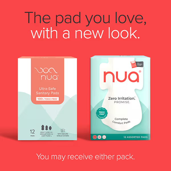
For the first five years, Nua operated primarily as a D2C brand with our website as the main sales channel. However, the rise of e-commerce marketplaces and the rapid growth of quick commerce in India prompted us to revisit our go-to-market strategy. The new packaging reflects this shift. It was important for the brand to communicate a compelling reason to switch, while also strengthening our identity to remain competitive in this evolving landscape. The new packaging is crafted to deliver that message with clarity, and the refreshed logo makes a bolder, more emphatic statement on shelf.
2. To what extent was the change in packaging driven by market feedback?
The change was driven by a combination of market insights and consumer feedback. Early signals came from teams at our online channel partners such as Amazon, Blinkit, who flagged that the Nua pack wasn’t standing out on the grid. In modern trade stores as well, it became clear that our offerings needed stronger visual cues to connect with both the category and the end consumer. We also reached out to consumers to better understand their reasons for switching to Nua. Interestingly, many referenced the experience of our D2C platform more than the product proposition itself. It underscored the need for our packaging to more effectively communicate the product’s core benefits and distinctiveness at a glance.
3. The decision to feature a sanitary pad prominently on the new packaging, and the incorporation of bright orange in the colour scheme are both departures from the earlier aesthetic. What do these departures say about the brand?
In a category that’s long been shaped by legacy players with deep-rooted consumer trust, and new-age brands riding the wave of trends, Nua needed to adopt a bold stance - one that doesn’t mimic either.
The decision to feature a sanitary pad upfront, and to embrace deeper Coral as a core brand colour, signals this clarity. It’s a deliberate shift designed not just to stand out, but to resonate with a new generation of consumers - those who are more open, aware, and unafraid to challenge outdated taboos. Our new aesthetic reflects this evolution in both the consumer mindset and the broader cultural narrative around periods. It’s honest, unapologetic, and confidently aligned with the times.
4. What are some of the ‘trends’ that other brands ride on?
Consumers today are increasingly drawn to products that are both good for them and good for the planet. Across categories, brands are responding - from refillable skincare to plant-based foods. But in the sanitary pad space, this has led to a rise in misleading claims. The truth is, when it comes to menstrual hygiene products, it’s nearly impossible to balance product efficacy and sustainability in one solution.
At Nua, we choose honesty over hype. We don’t chase trends or make hollow promises. Instead, we stay focused on what matters: creating products that solve real problems for real women - with integrity at the core.
5. How does the re-packaging impact the brand’s personality?
Consumers today are bolder, more expressive, and deeply self-aware; and it’s only natural that we evolve with them. Our brand’s personality has grown to reflect this shift: it’s now bolder, more real, and more in tune with the modern woman.The new visual identity isn’t just a cosmetic change; it’s rooted in deep psychographic insight into how today’s consumers think, feel, and engage. It’s a reflection of who she is, and who we are alongside her.
6. How have consumers reacted to the new visual identity?
It’s early days, but we’re actively listening and learning from consumer feedback. The real measure of success will be whether they connect with the problem we’ve brought forward, see value in our solution, and ultimately view Nua as a brand that stands apart from the rest.


